Rebranding Secrets Big Brands , Airtel, Mahindra & Tata motors
In today’s fast-paced corporate environment, one thing separates businesses that remain current from those that fade away: rebranding. It’s more than just changing logos and colors; it’s about rewriting perceptions, reconnecting with audiences, and rekindling development. Let’s look at how India’s top brands (Air India, Airtel, Mahindra, and Tata motors) mastered the art of rebranding and what you can learn from them.
1. Air India – A Maharaja Reimagined
After decades as India’s national carrier, Air India’s 2023 rebrand under Tata Group marked a bold leap into the future.

🔄 Rebranding Highlights
- New Logo: The “Vista” — a modern red-gold window frame symbolizing limitless possibilities.
- Color Shift: From deep red and cream to a vibrant aubergine and gold, blending heritage with global sophistication.
- Design Language: Sleek livery, refreshed Maharaja mascot, and premium service cues.
Takeaway
Air India’s rebrand shows how legacy brands can evolve with modern aesthetics, global ambition, and emotional continuity — turning nostalgia into aspiration.
I can now help you format this into a carousel or visual post with logo comparisons and color palettes.
2. Airtel – A Modern Makeover for the Digital Age

Airtel’s rebrand in 2010 marked a shift from being a telecom brand to a global communication brand. The new lowercase red logo with the ‘wave’ symbol and tagline “Dil Jo Chahe, Pass Laye” made the brand feel more youthful and emotionally connected.
Logo Evolution: The wave-shaped ‘a’ was introduced to reflect movement, energy, and a more human connection. Red symbolized passion and strength — a sharp contrast from the older, more corporate logo.
Rebranding Secret: Airtel didn’t just change visuals – it evolved its tone, moving from corporate to conversational. It was about bridging hearts, not just networks.
Takeaway: A successful rebrand is emotional as much as visual. It should speak to the evolving lifestyle of your audience.
3. Mahindra – Building a Global, Unified Brand Identity
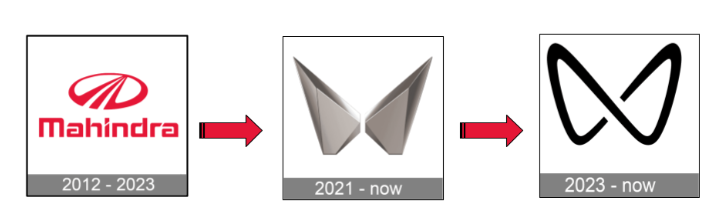
Mahindra underwent a rebrand in 2021, introducing the new Twin Peaks logo to represent modernity, ambition, and global reach. This rebrand unified its different divisions – from automotive to technology – under one strong identity.
Logo Evolution: The Twin Peaks logo replaced the classic round-oval emblem that once resembled a road encircling progress. This new butterfly-shaped ‘M’ design symbolizes freedom, transformation, and forward motion. Its bold, angular lines reflect Mahindra’s focus on innovation, technology, and modern mobility.
Rebranding Secret: Consistency across sectors built trust and recognition. Mahindra embraced a futuristic design language while keeping its Indian legacy intact.
Takeaway: For large businesses, rebranding is about cohesion and clarity – bringing every branch of your brand under one story.
4. Tata Motors – From Utility to Strong quality
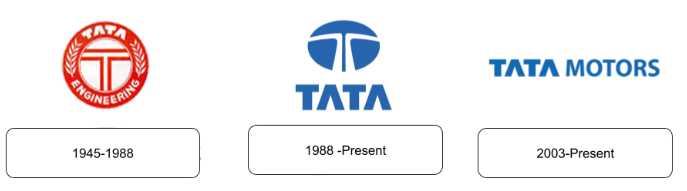
Tata Motors, once known primarily for rugged commercial vehicles and budget-friendly cars, underwent a strategic rebrand starting around 2016–2018, with a strong push into design, safety, and innovation.
Logo and Brand Evolution: While the core Tata logo remained unchanged, the brand language and positioning of its passenger vehicle division evolved dramatically.
The launch of the Impact Design philosophy (Impact 1.0 and later Impact 2.0) introduced sleek, modern aesthetics in models like the Tiago, Nexon, Harrier, and Altroz.The brand began emphasizing safety, with several models achieving high Global NCAP ratings — a major shift from its earlier value-driven positioning.
Rebranding Secret: Tata Motors repositioned itself as a design-forward, safety-conscious, and tech-savvy brand, appealing to younger, urban consumers. It also created sub-brands like Tata ev to signal its commitment to electric mobility, with models like the Nexon EV and Tiago EV gaining traction.
Takeaway: A successful rebrand doesn’t always require a new logo — it can be driven by product innovation, design language, and emotional storytelling. Tata’s transformation shows how legacy brands can reinvent themselves by aligning with modern consumer values like sustainability, safety, and style.
The Hidden Formula Behind Every Great Rebrand
- Understand your audience again. People evolve, and so should your brand.
- Redefine your brand story. What do you stand for today?
- Modernize your logo and look, but stay authentic. A logo isn’t just a symbol — it’s your story in a shape.
- Create emotional impact. Rebrands that touch hearts create loyal fans.
- Stay consistent across touchpoints. From packaging to posts, everything should speak one language.
Final Thought: It’s Never Too Late to Reinvent.
Whether you’re a startup or a legacy brand, the world changes fast – and your audience’s attention even faster. Rebranding is your chance to realign your purpose, refresh your image, and reconnect with people.
Because when done right, rebranding isn’t just a facelift – it’s a rebirth.